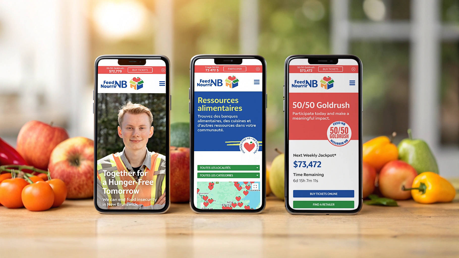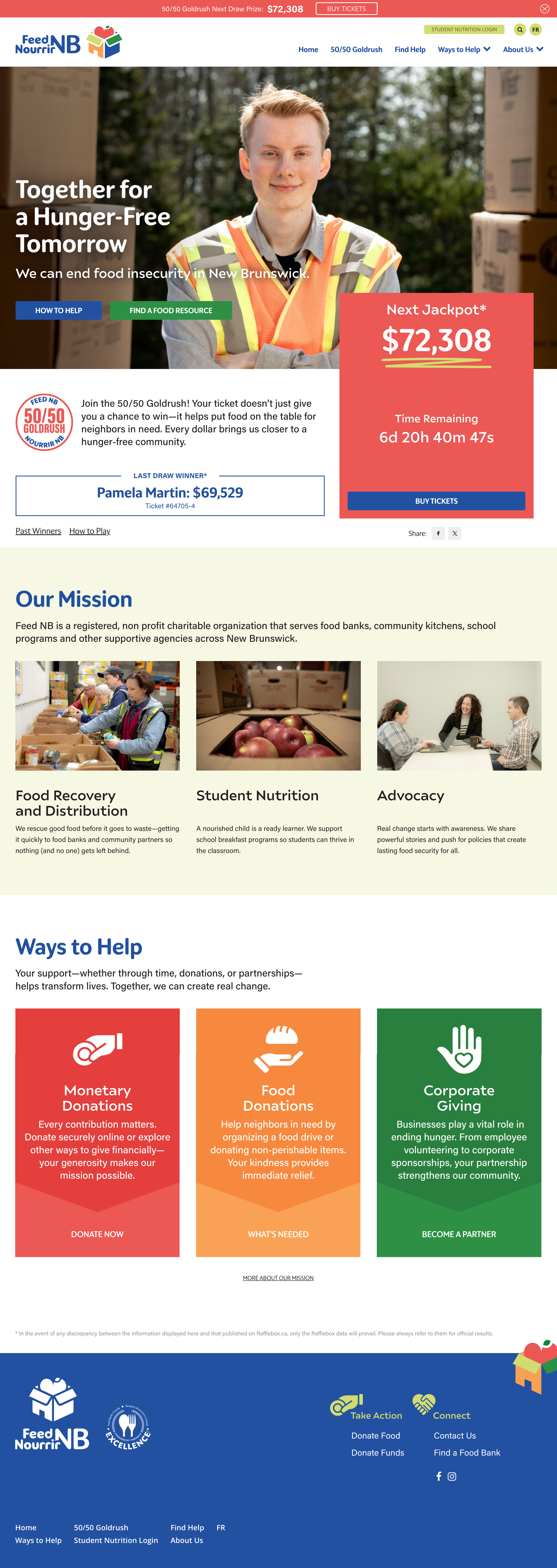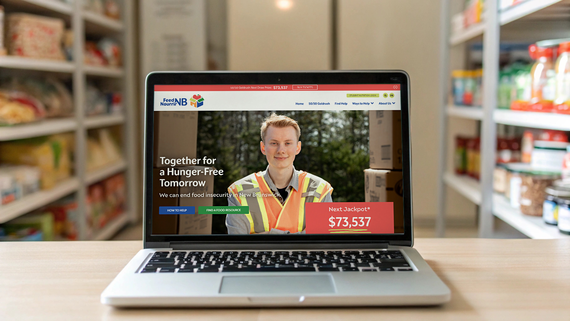
The goal was to build a bilingual website that captured the spirit of the rebrand and offered a clear, intuitive path for users to explore, get involved, support their local food banks, and stay in the loop with initiatives like the province-wide 50/50 draw. It needed to feel welcoming, trustworthy, and easy to navigate for everyone.
The project rolled out in thoughtful, structured phases following a proven approach to user-centered design and development. We started by identifying key user types to better understand their needs and priorities. From there, we planned the site map and audited existing content to streamline the experience. Wireframes and mock-ups brought the design vision into focus, and interactive prototypes allowed for early feedback. The final product went live on schedule — cohesive, accessible, and aligned with the brand’s new direction.
The site is powered by a flexible custom WordPress build. Now that the site is live, it’s set to become a central digital hub for Feed Nourrir NB’s communications, awareness efforts, and community engagement.